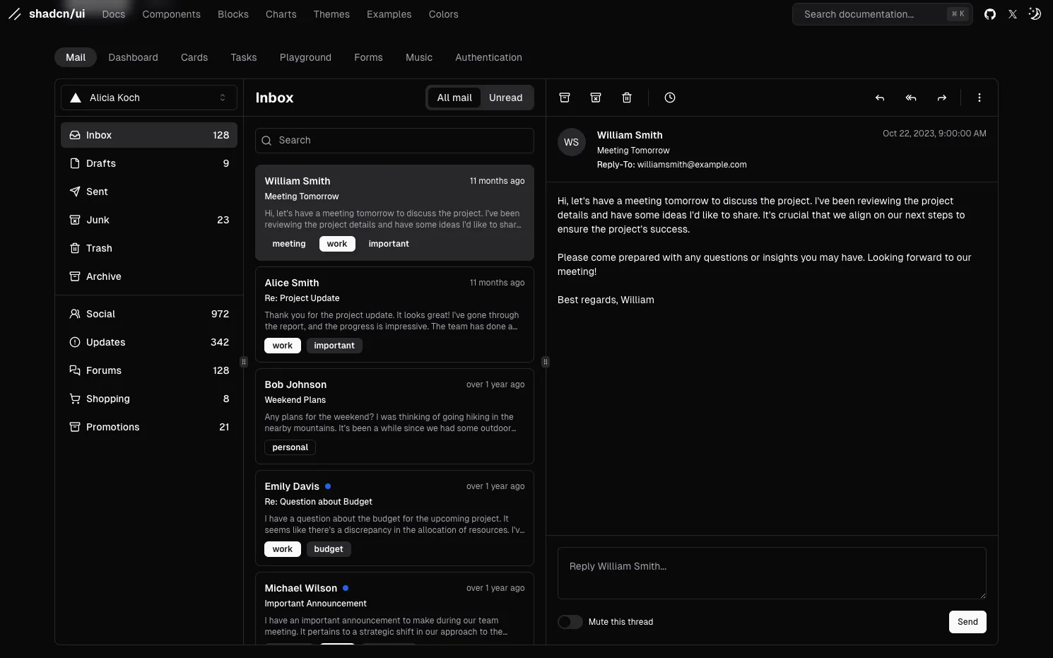
Build Your Component Library with shadcn
shadcn is a thoughtfully crafted component library designed to help you create beautiful, consistent user interfaces. With a focus on flexibility and ease of use, shadcn provides a wide range of pre-designed components that you can seamlessly integrate into your React apps.
Key Features:
- Copy-Paste Simplicity: No complex setups—simply copy and paste components into your project.
- Customizable Design: Tailor each component to fit your app’s branding and style.
- Built for React: Designed to work effortlessly with modern React-based workflows.
- Tailwind CSS Integration: Components are styled with Tailwind CSS, offering a consistent and responsive design system.
Whether you're building a personal project or scaling a professional app, shadcn empowers you to save time and focus on functionality while maintaining a polished UI.
Explore the full library and elevate your design workflow today at ui.shadcn.com.
shadcn
In the same category
Tags
CSSReactJS
Figma Plugins
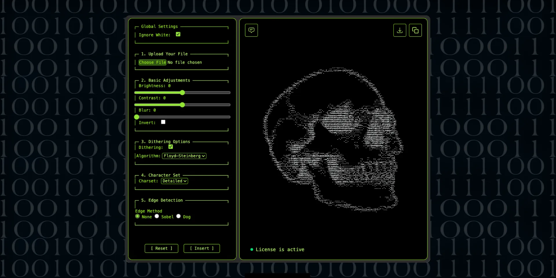
ASCII Art Generator Figma plugin
Clip Path Generator
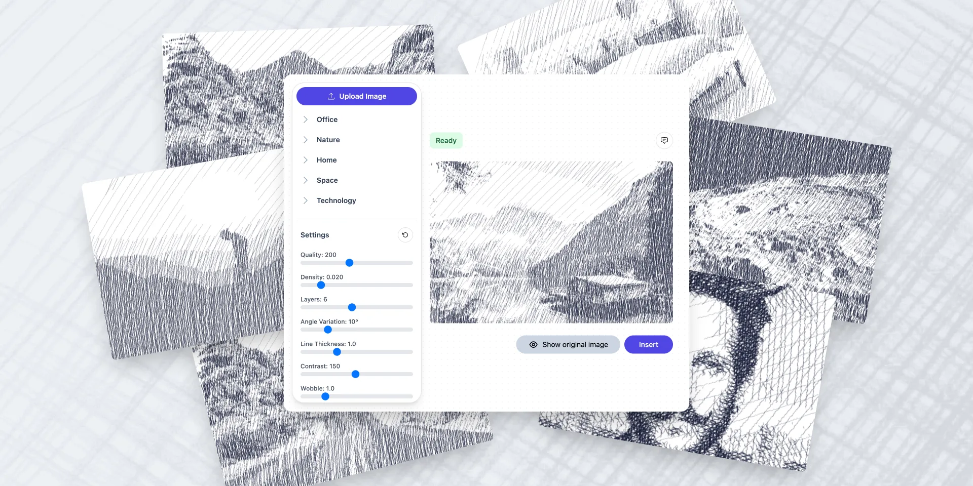
Crosshatch Image Effect Generator
Fancy Text Generator
Figma to Plugin API
Figma to React Bootstrap
Figma to Tailwind CSS AI

Figma to Tailwind CSS
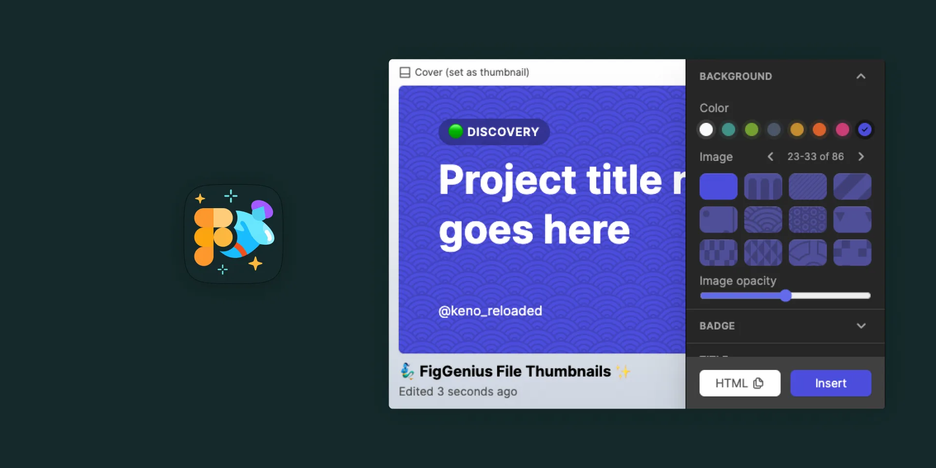
File Thumbnails Generator
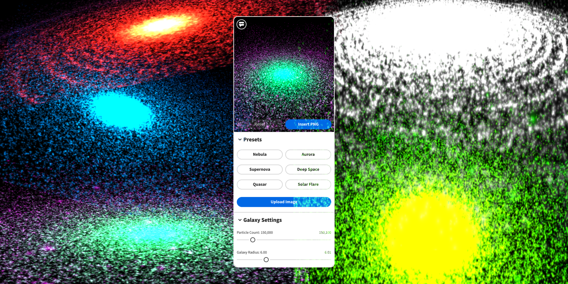
Galaxy Background Generator
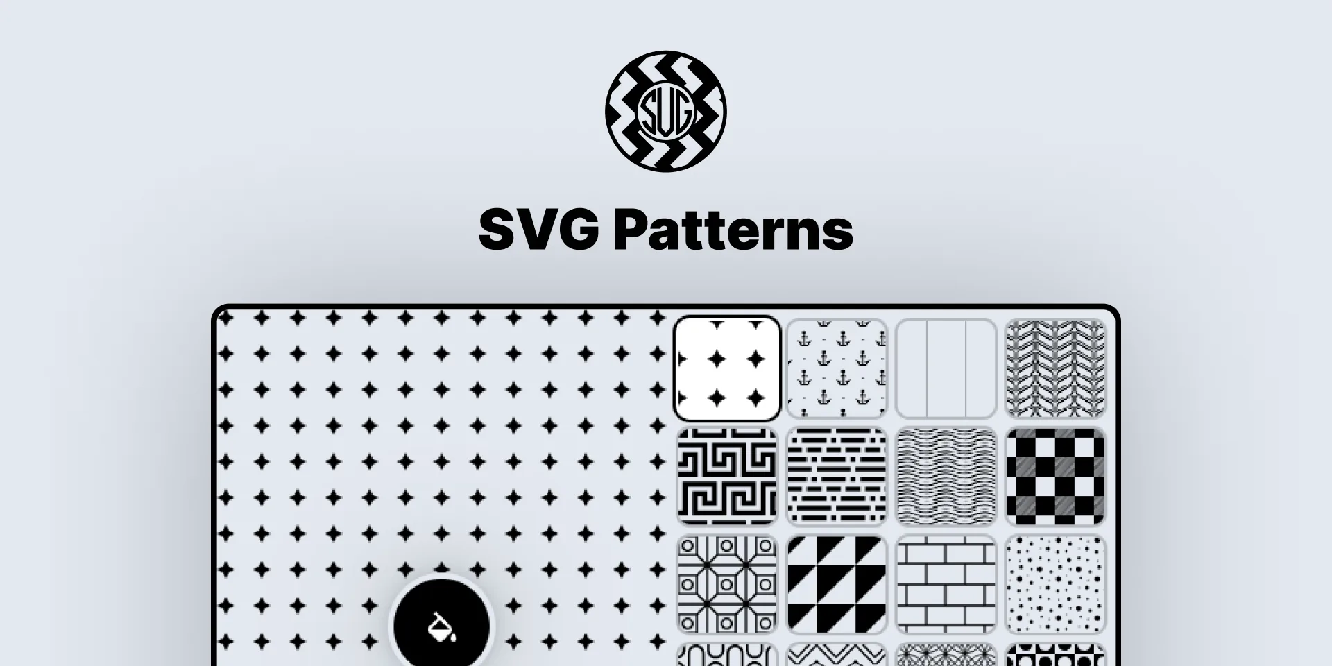
Geometric Tile Pattern SVG Generator

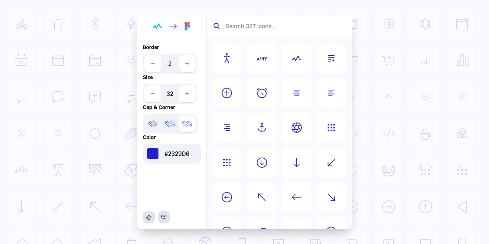
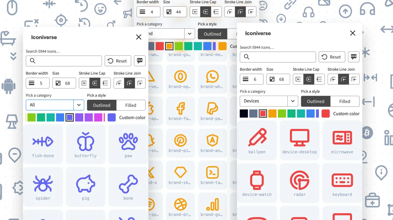
Iconiverse
Ikonate to Figma
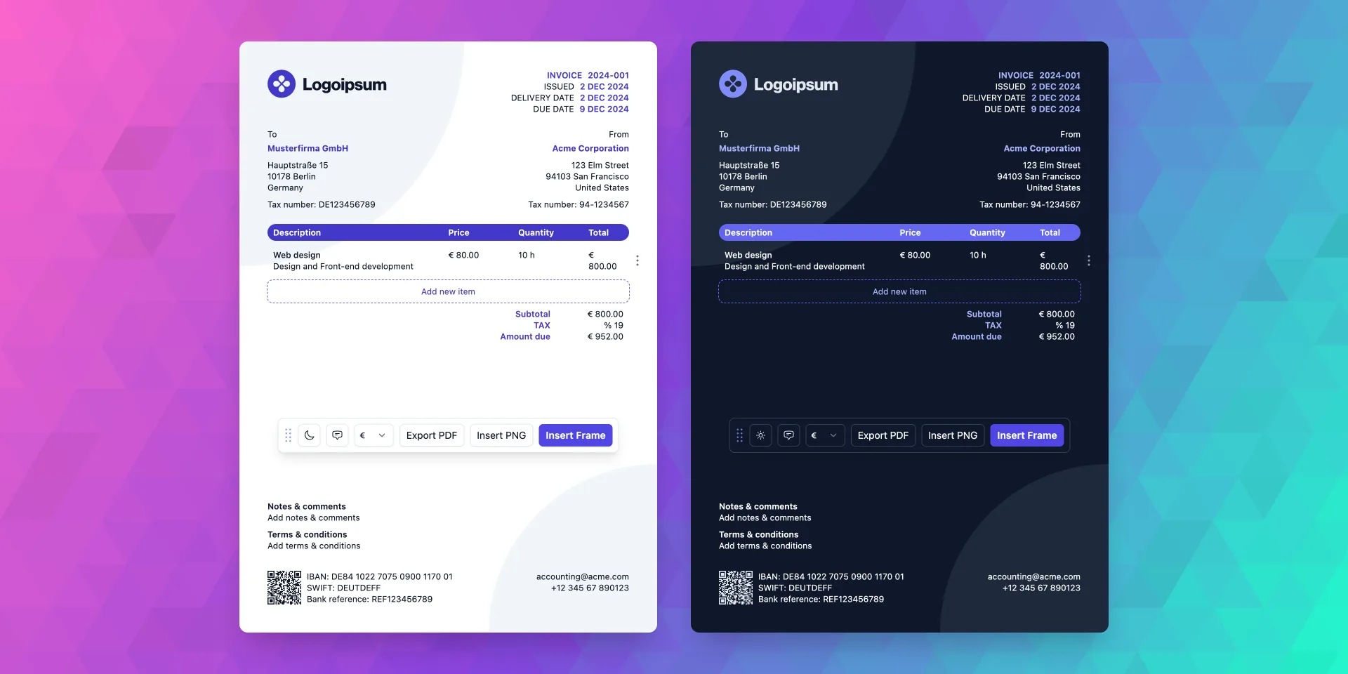
Invoice Gen Z
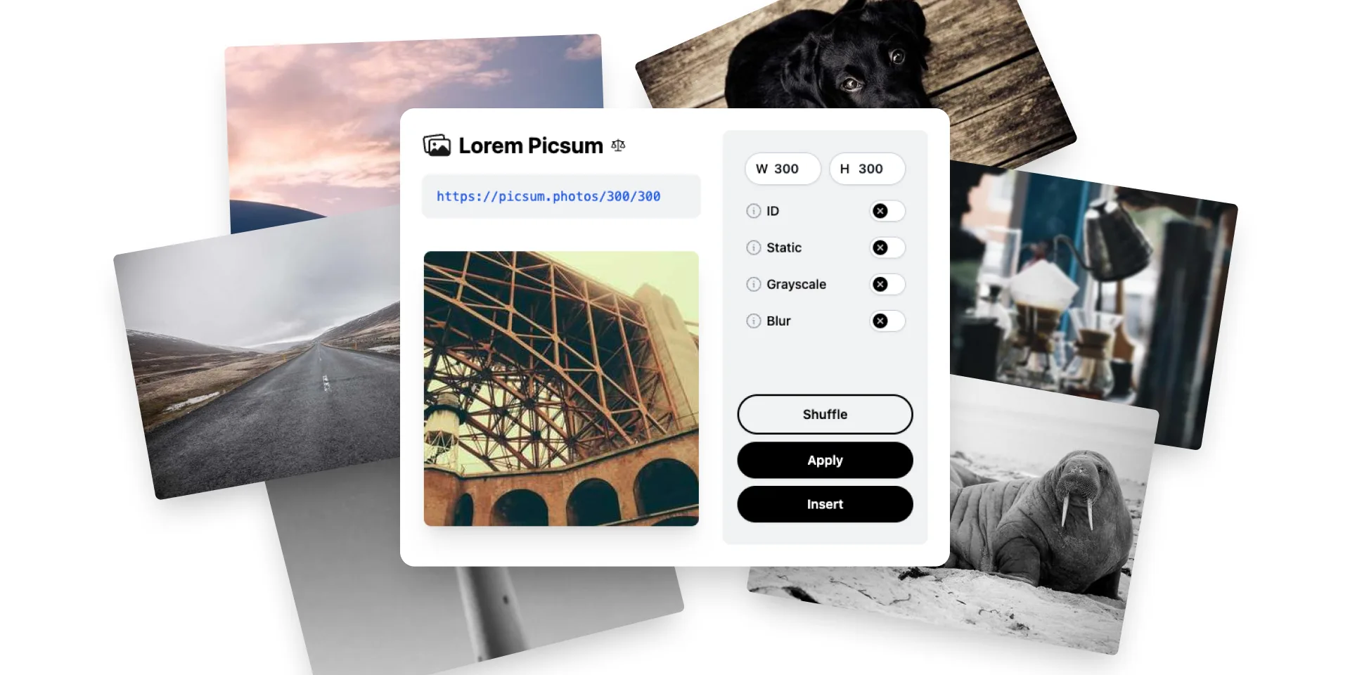
Lorem Picsum to Figma
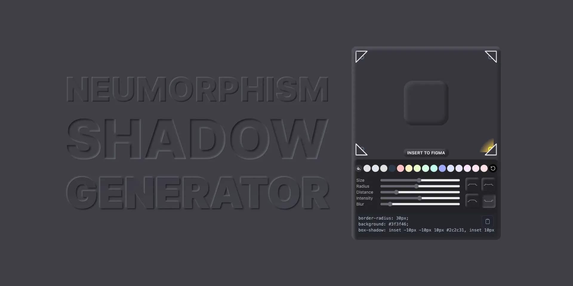
Neumorphism Shadow Generator
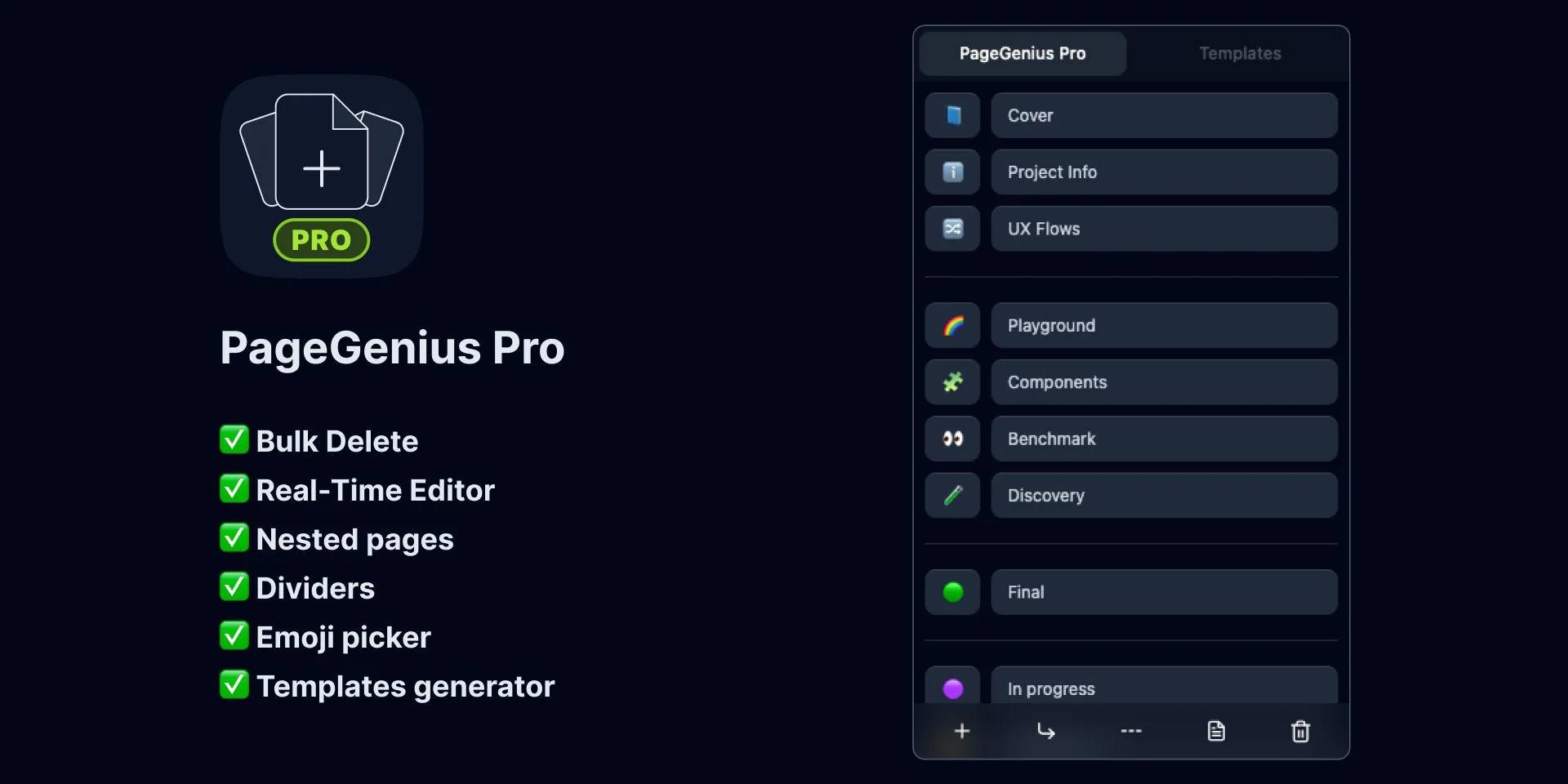
PageGenius Pro
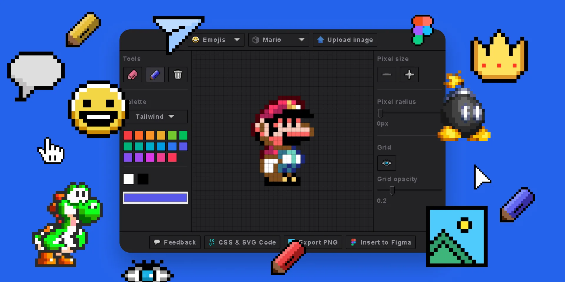
Pixel Art Generator
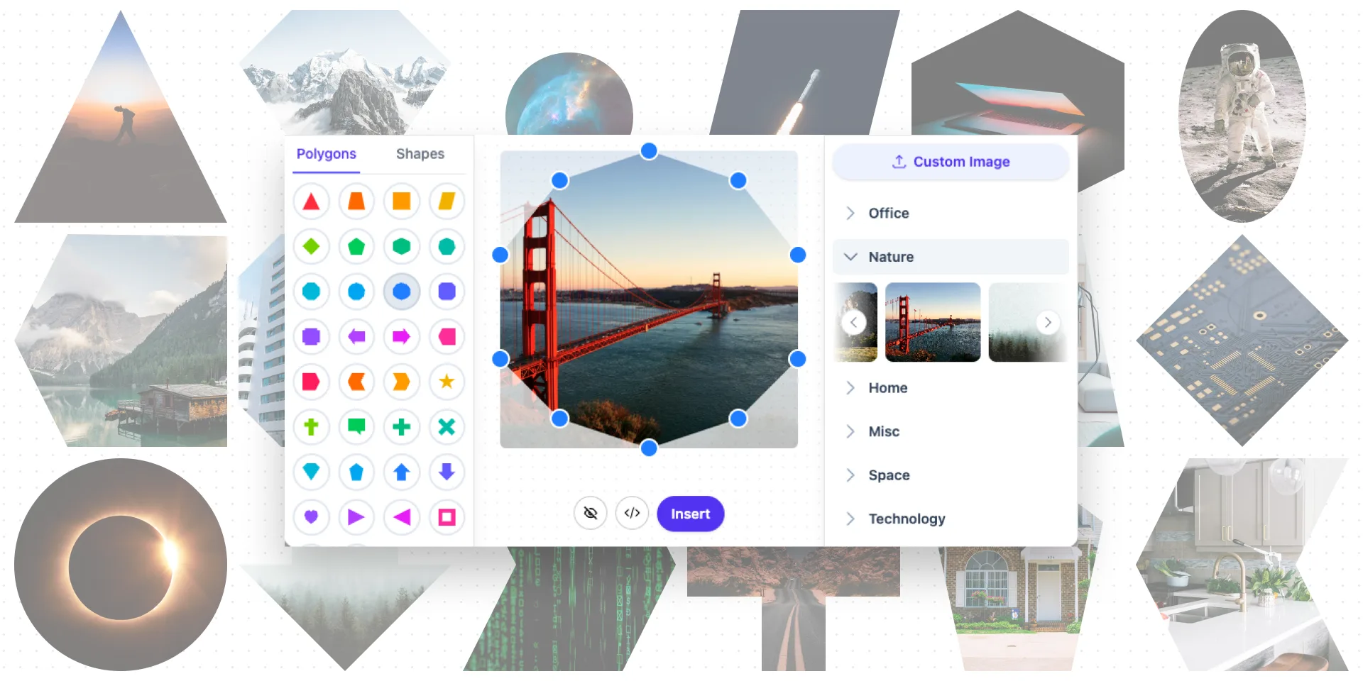
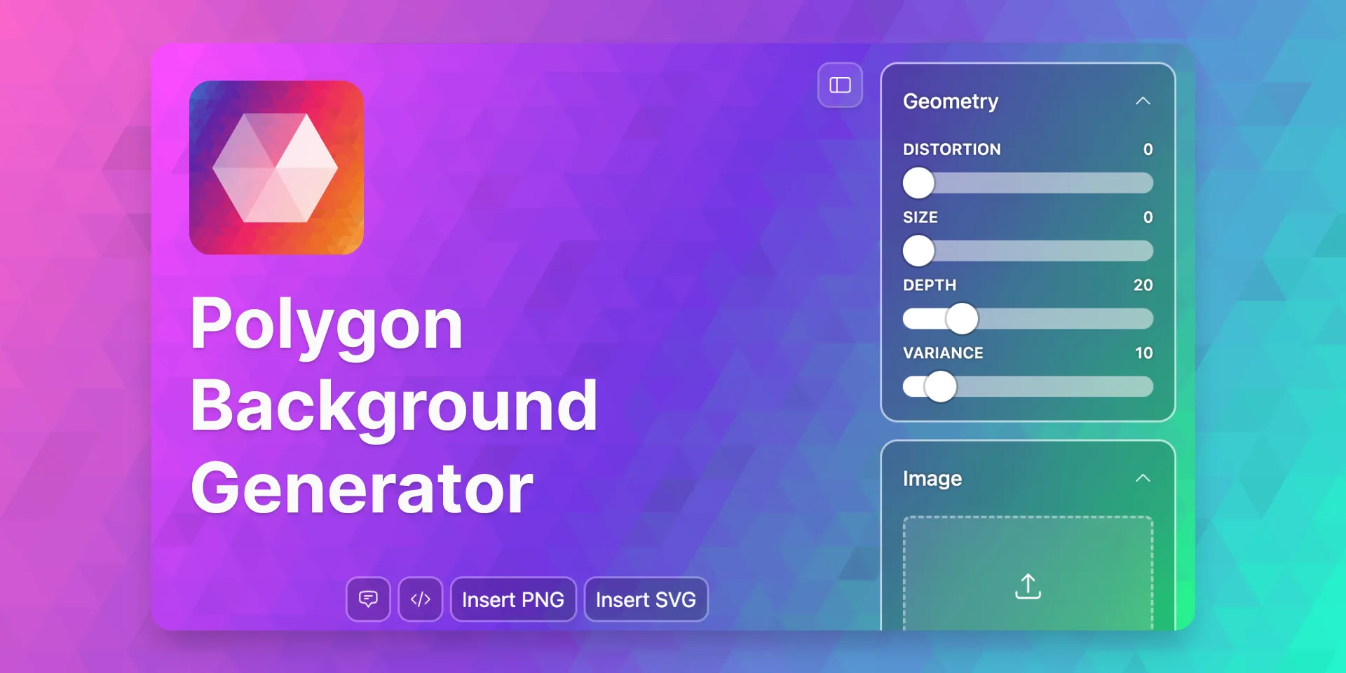
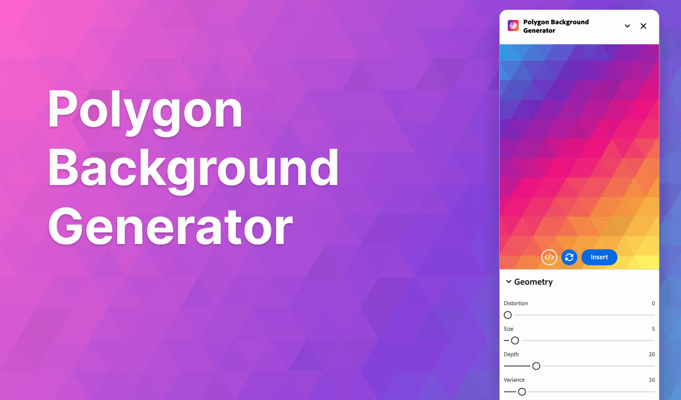
Polygon Background Generator
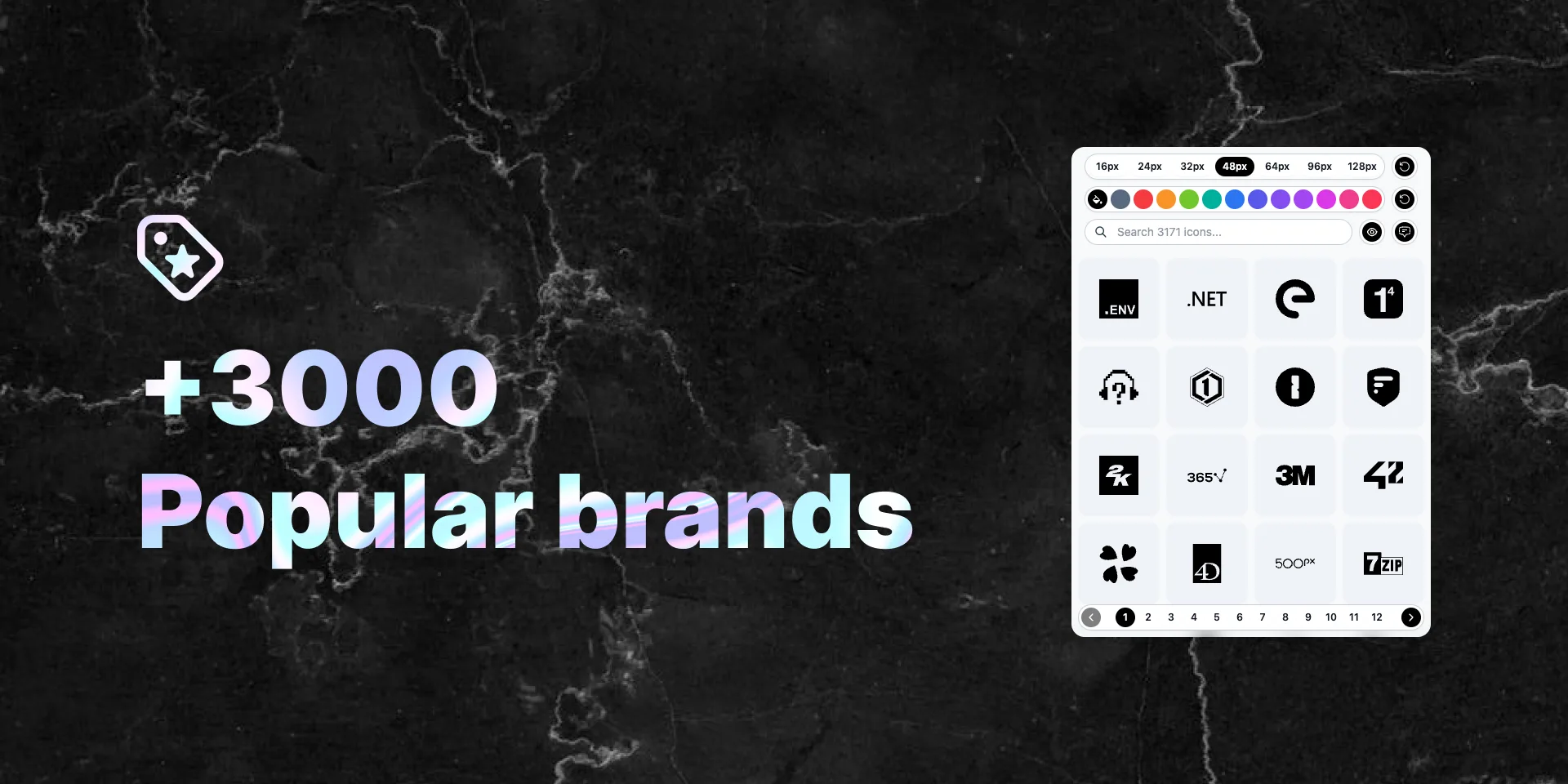
Popular Brand Logos
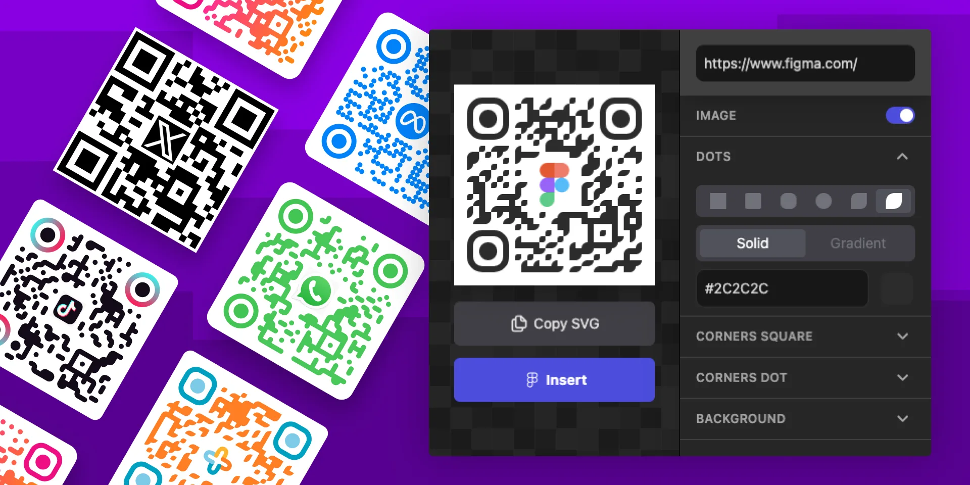
QR Code Gen Z
Seamless Waves Generator
SVG Patterns
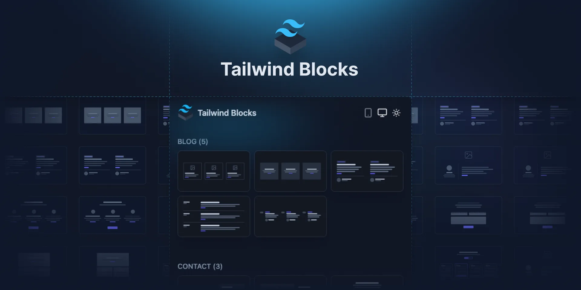
Tailwind Blocks
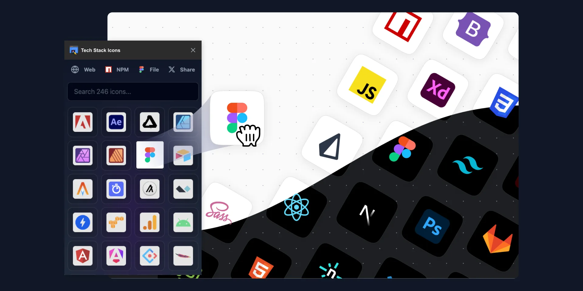
Tech Stack & Design Stack Icons
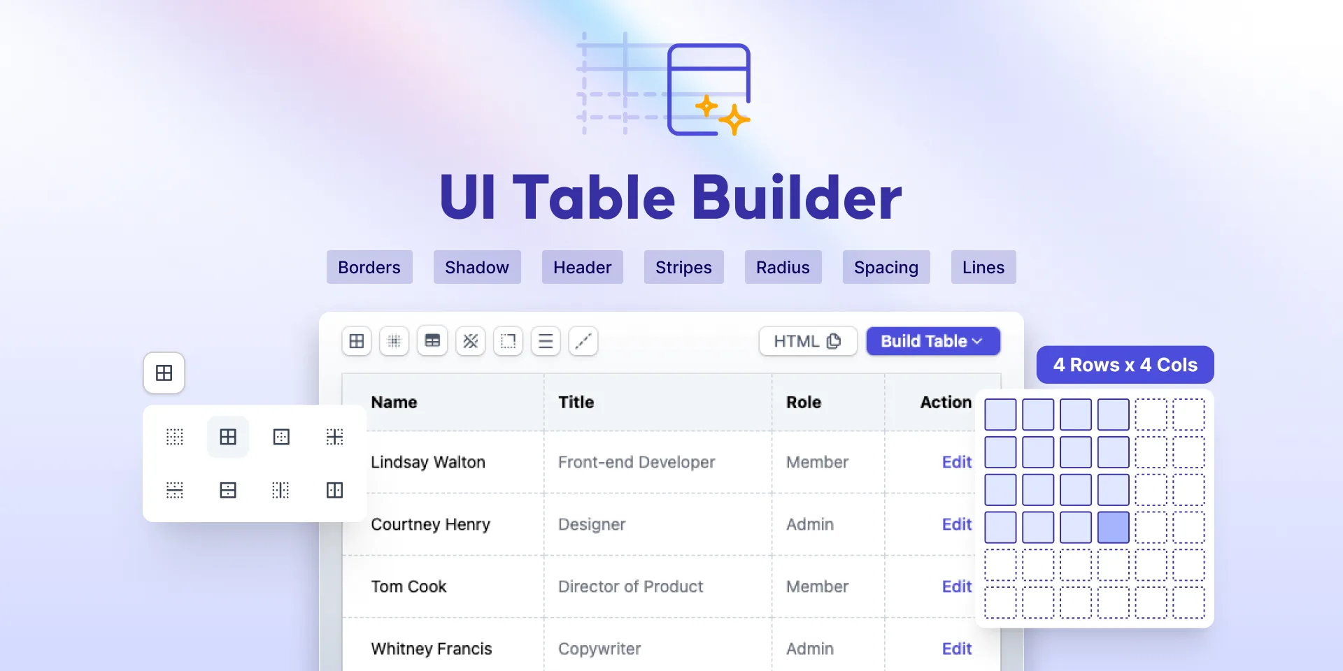
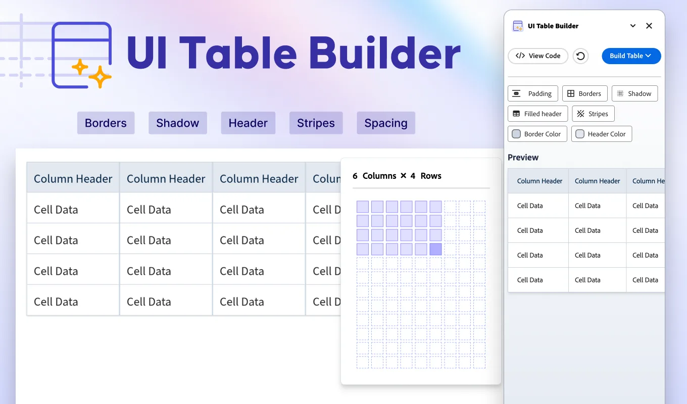
UI Table Builder
Ultimate Blob Maker Designer
Variables Doc Designer
Add-ons for Adobe Express
Blob Maker
Clip path generator

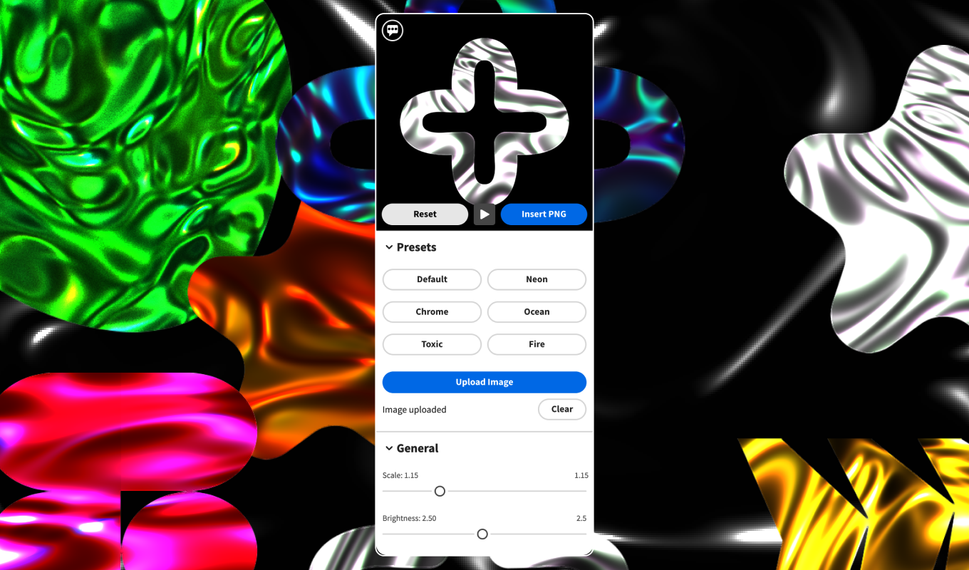
Liquid Metal Generator
Neumorphism Shadow Generator

Pixel Art Generator
Polygon Background Gen Z
UI Table Builder
Miro Apps
Blob Maker
Clip Path Generator
Iconiverse
Liquid Metal Generator
Neumorphism Shadow Generator
Pixel Art Generator
Polygon Background Generator
Tech Stack & Design Stack Icons