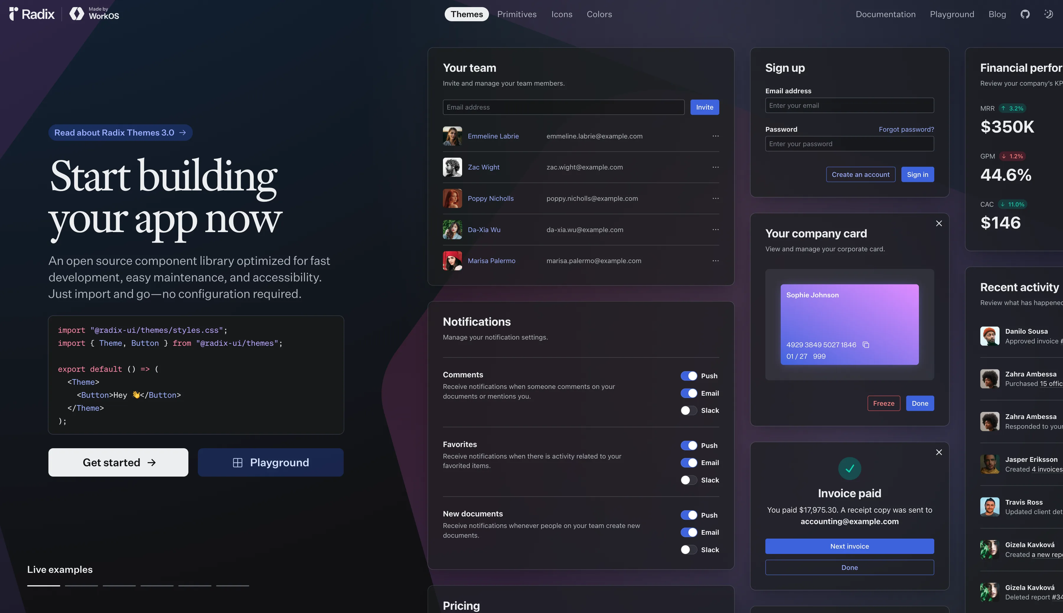
Radix UI is an open-source React component library of accessible, unstyled UI primitives — WAI-ARIA compliant, fully customizable, and performance-optimized for production-grade design systems.
What is Radix UI?
Radix UI is a collection of low-level, unstyled React primitives for building accessible, high-quality user interfaces. Unlike opinionated component libraries, Radix UI gives you full control over styling while handling all the complex accessibility logic — keyboard navigation, focus management, ARIA attributes — out of the box.
It is the foundation used by popular design systems including shadcn/ui and Origin UI.
Key Features
- Accessible by default — Every component adheres to WAI-ARIA design patterns, ensuring inclusivity for all users including those using screen readers
- Unstyled primitives — Ship with zero styles, so you can apply any design system or CSS framework (Tailwind, CSS Modules, styled-components)
- Composable API — Fine-grained component parts (Root, Trigger, Content, etc.) that you compose to build exactly what you need
- Animated-ready — Built to work with CSS animations and libraries like Framer Motion
- TypeScript first — Full TypeScript support with accurate types
Available Components
Radix UI primitives include:
- Dialog, Drawer, Alert Dialog
- Dropdown Menu, Context Menu, Navigation Menu
- Tooltip, Popover, Hover Card
- Select, Combobox, Radio Group, Checkbox, Switch
- Accordion, Tabs, Collapsible
- Slider, Scroll Area, Separator
- Toast, Progress, Avatar, Aspect Ratio
Why Choose Radix UI?
Radix UI solves one of the hardest UI engineering problems: accessibility. Instead of building dropdown menus, dialogs, and tooltips from scratch and getting keyboard interactions wrong, Radix handles it all correctly while you focus on visual design.
It's the go-to choice for teams who want design freedom + accessibility compliance without maintaining their own accessible component logic.
Radix UI vs. Alternatives
| Radix UI | shadcn/ui | Origin UI | |
|---|---|---|---|
| Styled? | ❌ Unstyled | ✅ Tailwind | ✅ Tailwind |
| Accessible? | ✅ Yes | ✅ Yes | ✅ Yes |
| Customizable? | ✅ Full | ✅ High | ✅ High |
| Based on Radix? | — | ✅ Yes | ✅ Yes |
Related Resources
Radix UI
In the same category
Tags
Figma Plugins
ASCII Art Generator Figma plugin
Clip Path Generator
Crosshatch Image Effect Generator

Fancy Text Generator
Figma to Plugin API
Figma to React Bootstrap
Figma to Tailwind CSS AI

Figma to Tailwind CSS
File Thumbnails Generator
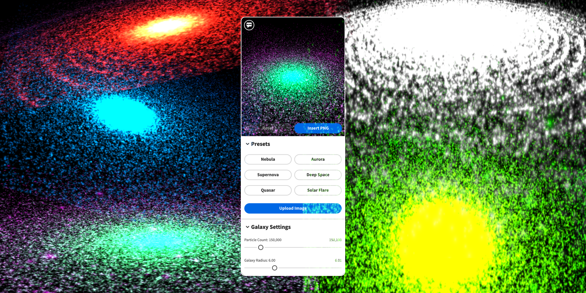
Galaxy Background Generator
Geometric Tile Pattern SVG Generator

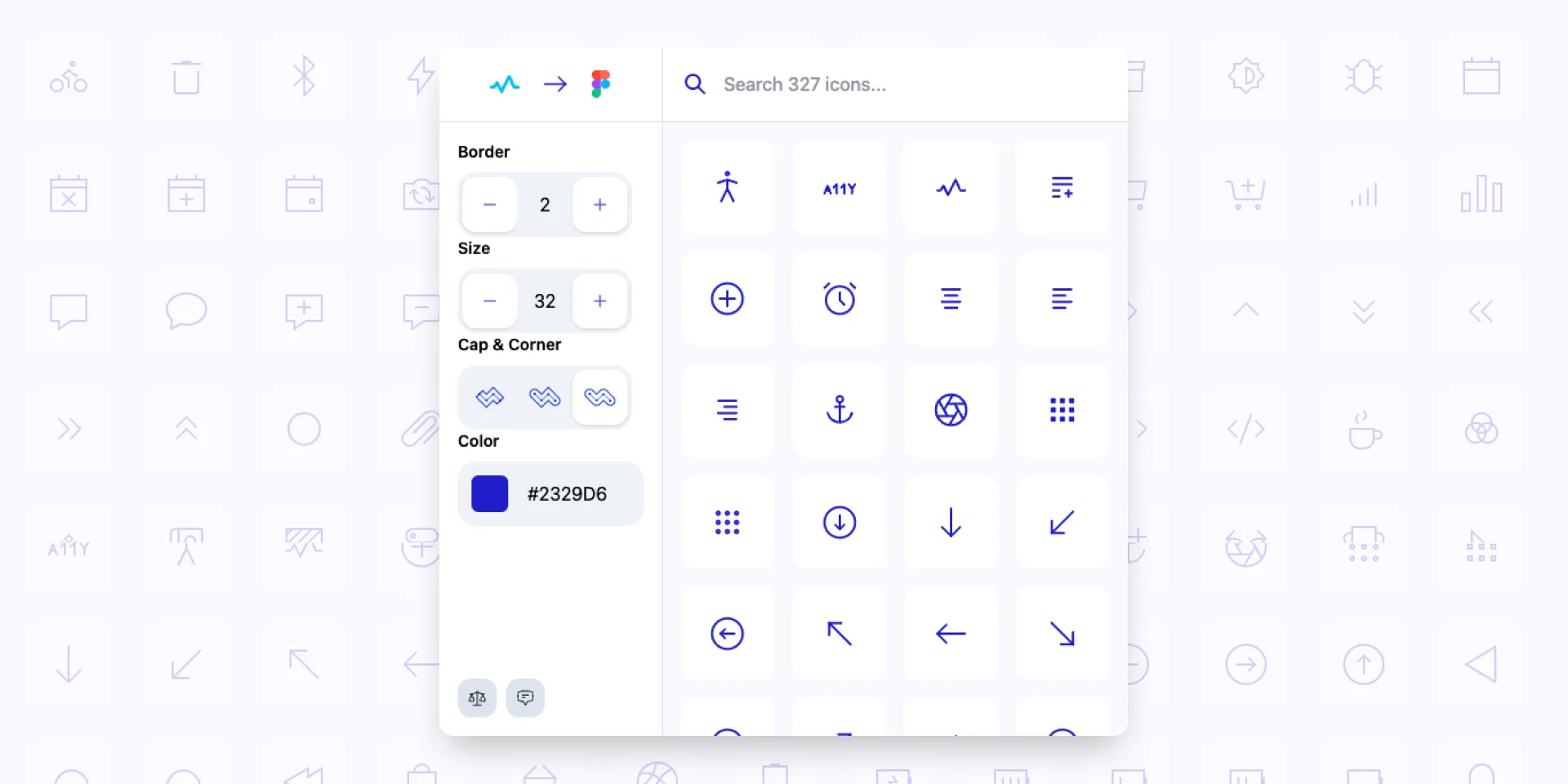
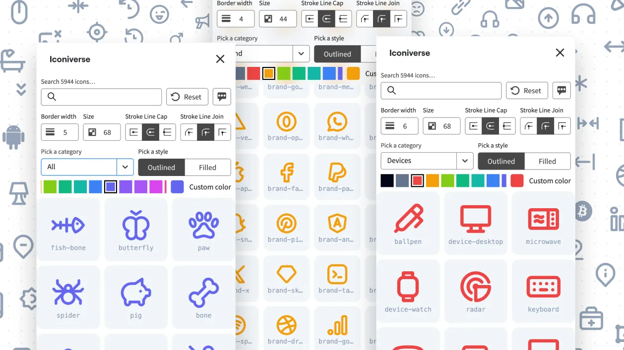
Iconiverse

Ikonate to Figma
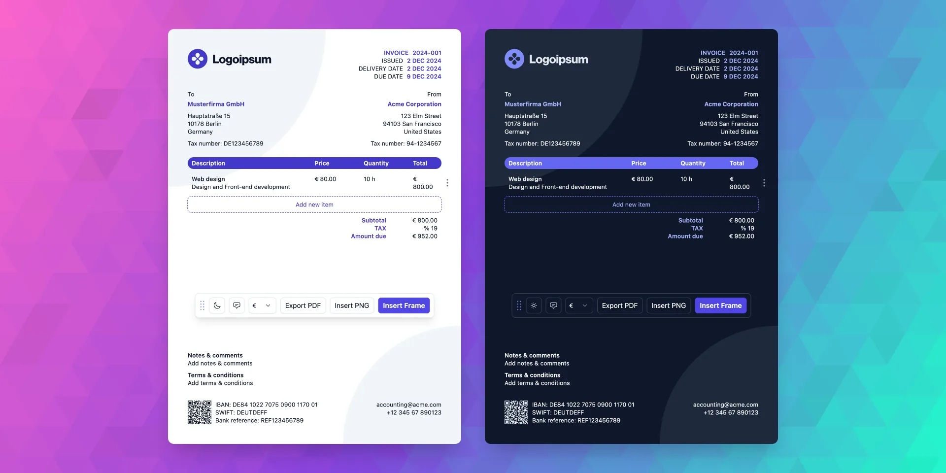
Invoice Gen Z
Lorem Picsum to Figma

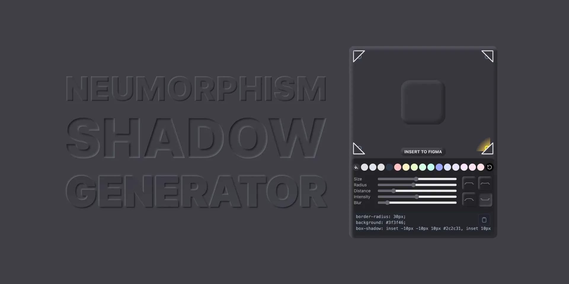
Neumorphism Shadow Generator
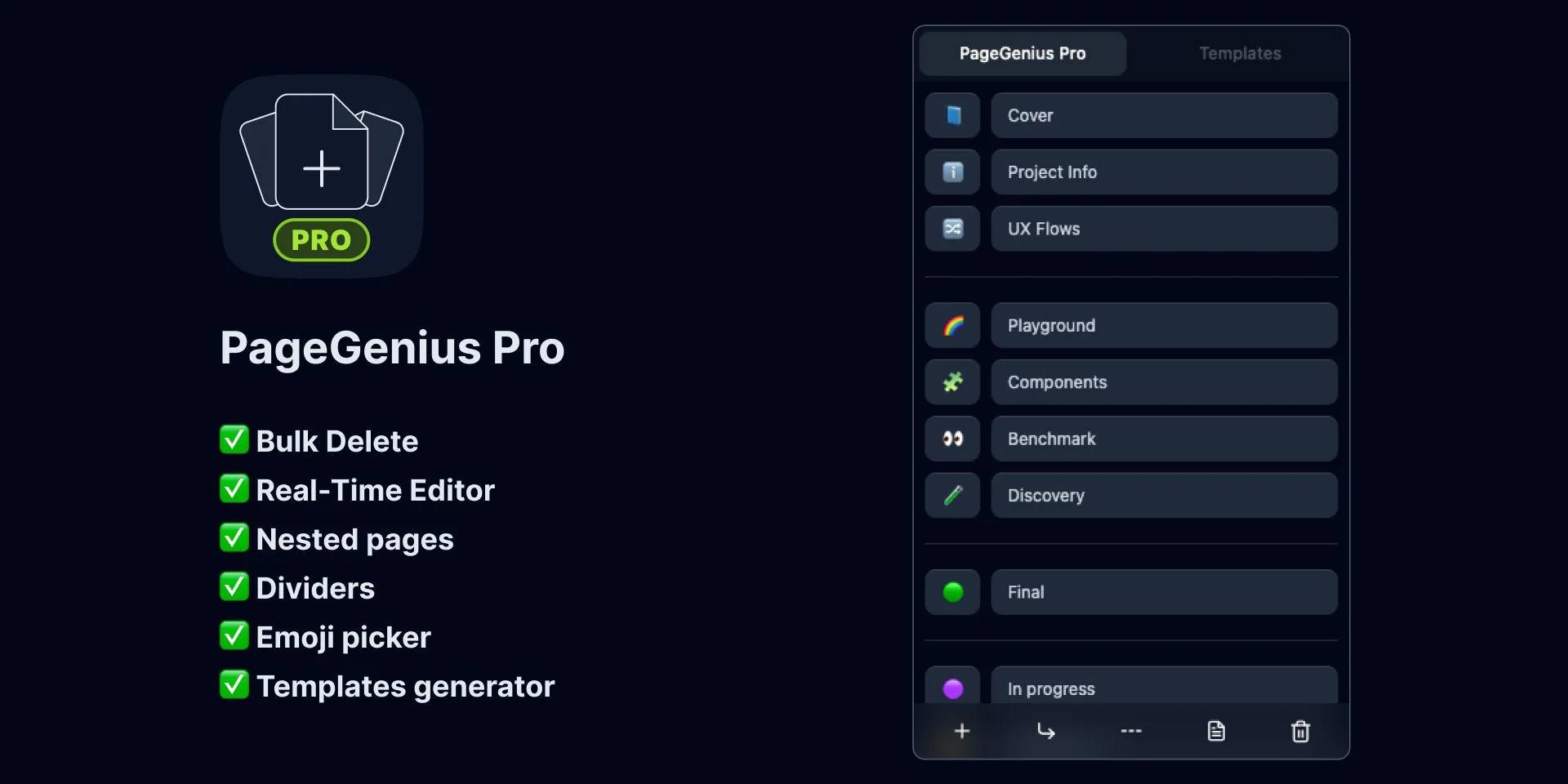
PageGenius Pro
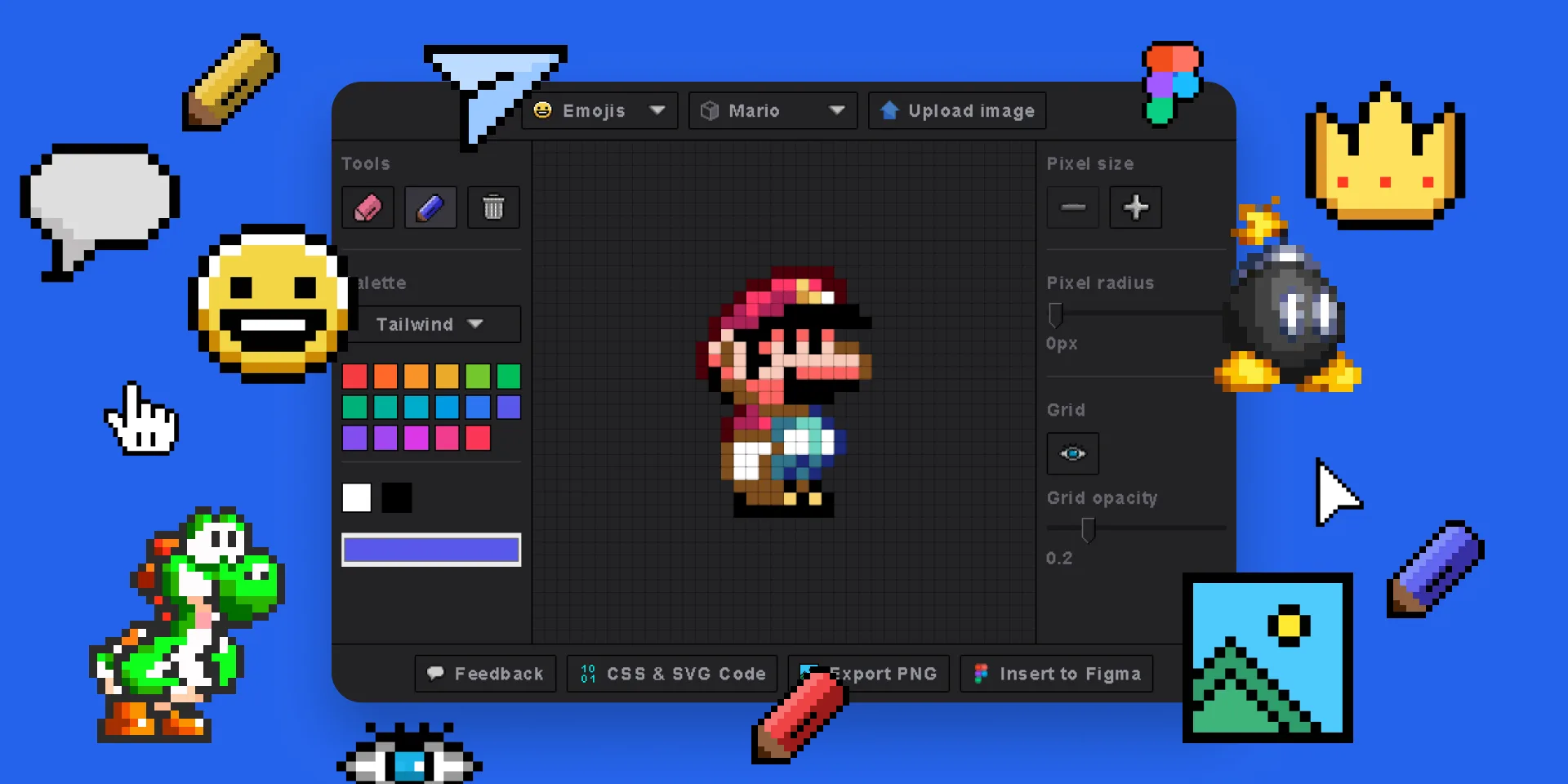
Pixel Art Generator
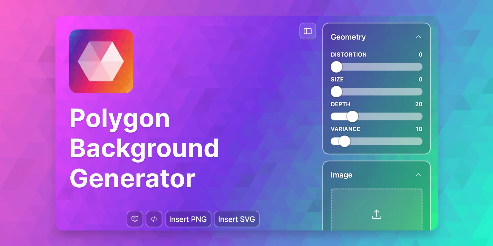
Polygon Background Generator
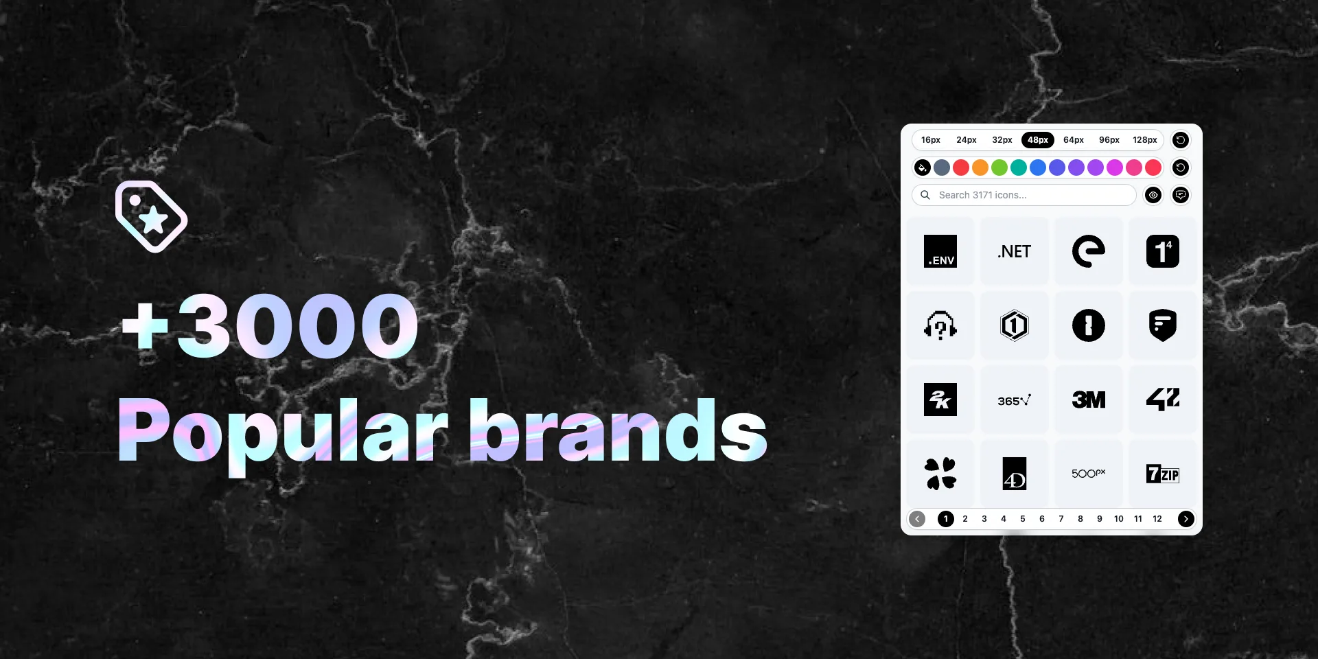
Popular Brand Logos
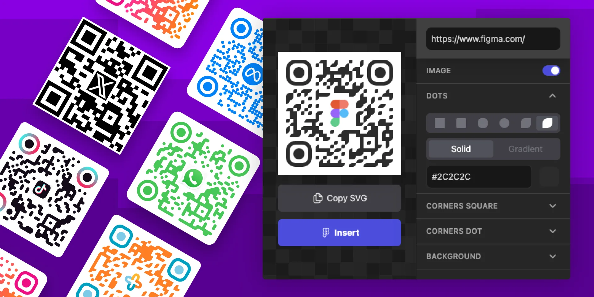
QR Code Gen Z
Seamless Waves Generator
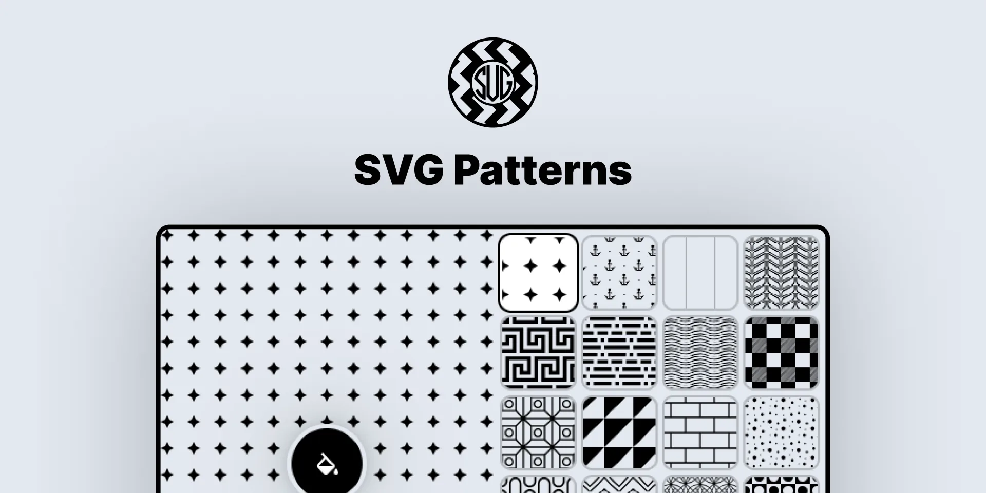
SVG Patterns
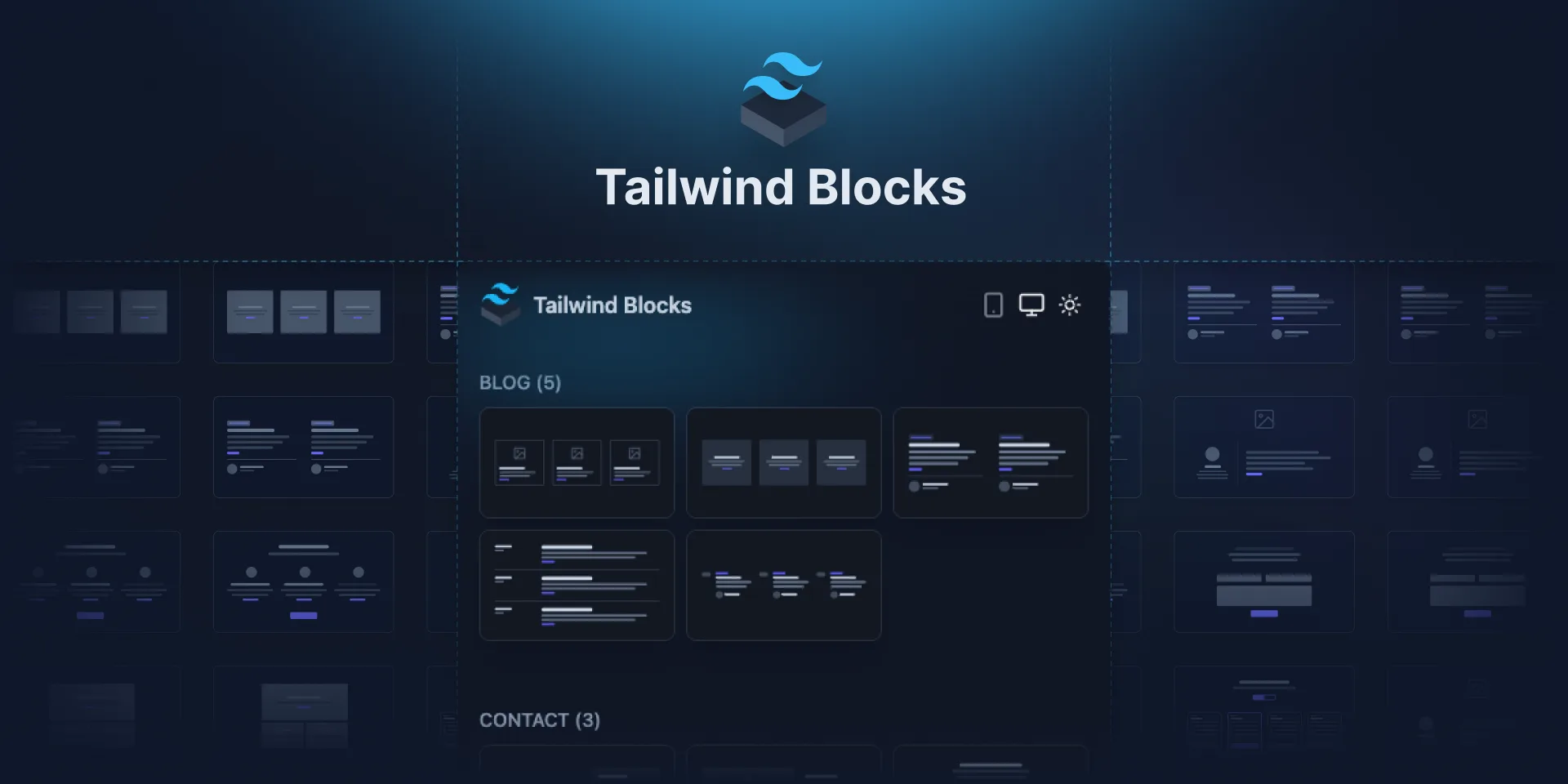
Tailwind Blocks
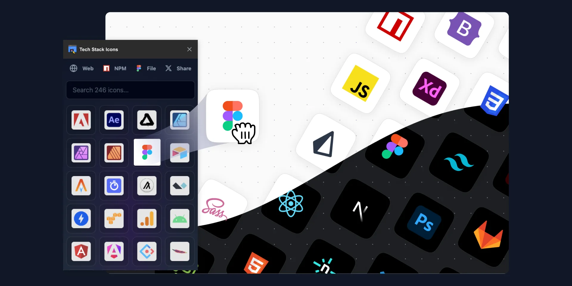
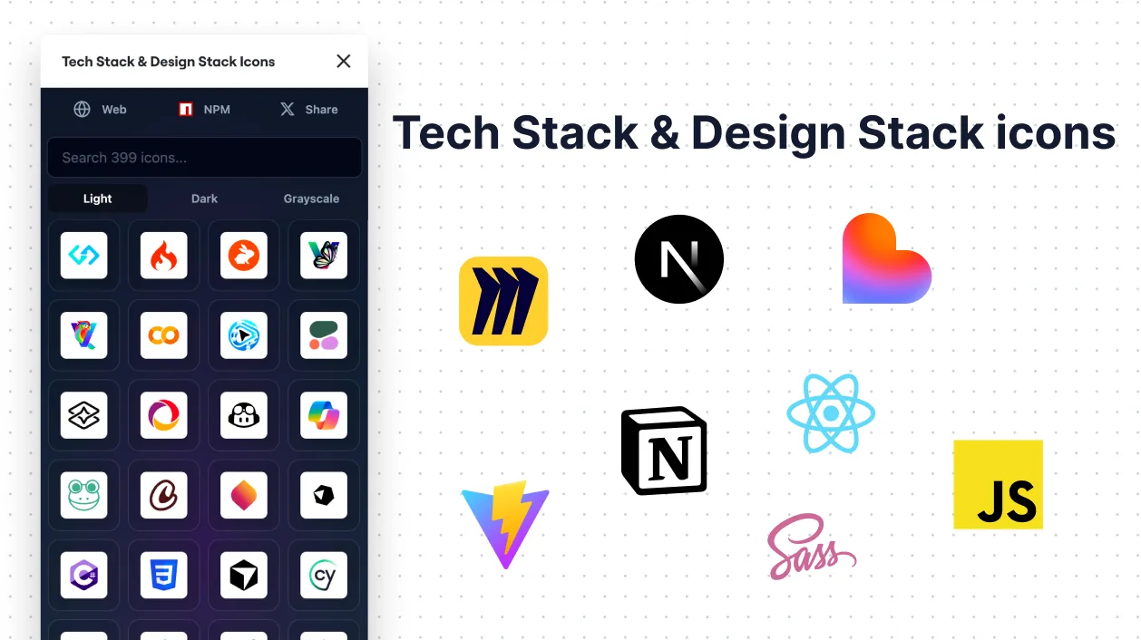
Tech Stack & Design Stack Icons
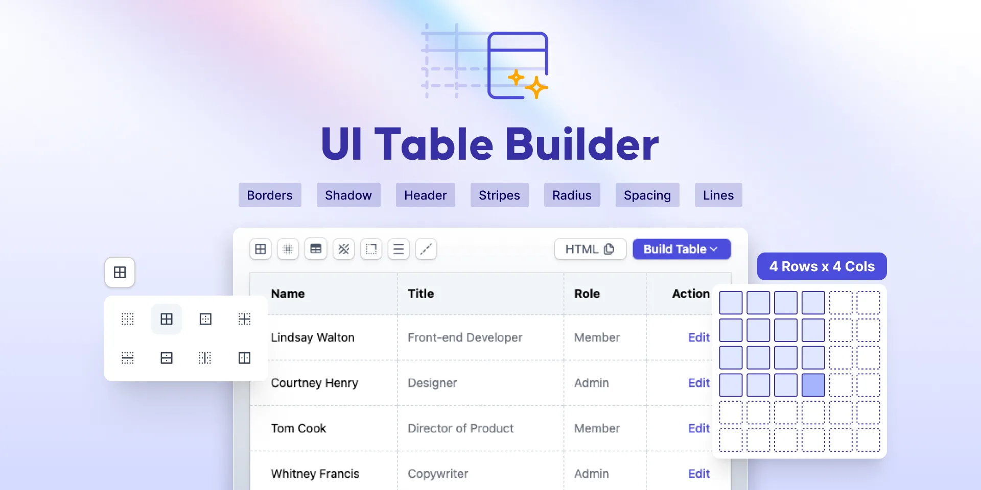
UI Table Builder
Ultimate Blob Maker Designer
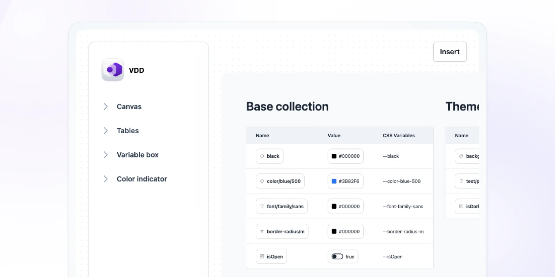
Variables Doc Designer
Add-ons for Adobe Express
Blob Maker
Clip path generator

Liquid Metal Generator
Neumorphism Shadow Generator

Pixel Art Generator
Polygon Background Gen Z
UI Table Builder
Miro Apps
Blob Maker
Clip Path Generator
Iconiverse
Liquid Metal Generator
Neumorphism Shadow Generator
Pixel Art Generator
Polygon Background Generator
Tech Stack & Design Stack Icons